
| Top |  |
 |
 |
 |
Functions
Types and Values
| struct | GtkCssProvider |
| enum | GtkCssProviderError |
| GtkCssSection | |
| enum | GtkCssSectionType |
Description
GtkCssProvider is an object implementing the GtkStyleProvider interface. It is able to parse CSS-like input in order to style widgets.
Default files
An application can cause GTK+ to parse a specific CSS style sheet by
calling gtk_css_provider_load_from_file() and adding the provider with
gtk_style_context_add_provider() or gtk_style_context_add_provider_for_screen().
In addition, certain files will be read when GTK+ is initialized. First,
the file $XDG_CONFIG_HOME/gtk-3.0/gtk.css
is loaded if it exists. Then, GTK+ tries to load
$HOME/.themes/theme-name/gtk-3.0/gtk.css,
falling back to
datadir/share/themes/theme-name/gtk-3.0/gtk.css,
where theme-name is the name of the current theme
(see the “gtk-theme-name” setting) and datadir
is the prefix configured when GTK+ was compiled, unless overridden by the
GTK_DATA_PREFIX environment variable.
Style sheets
The basic structure of the style sheets understood by this provider is a series of statements, which are either rule sets or “@-rules”, separated by whitespace.
A rule set consists of a selector and a declaration block, which is a series of declarations enclosed in curly braces ({ and }). The declarations are separated by semicolons (;). Multiple selectors can share the same declaration block, by putting all the separators in front of the block, separated by commas.
An example of a rule set with two selectors:
Selectors
Selectors work very similar to the way they do in CSS, with widget class names taking the role of element names, and widget names taking the role of IDs. When used in a selector, widget names must be prefixed with a '#' character. The “*” character represents the so-called universal selector, which matches any widget.
To express more complicated situations, selectors can be combined in various ways:
To require that a widget satisfies several conditions, combine several selectors into one by concatenating them. E.g.
GtkButton#button1matches a GtkButton widget with the name button1.To only match a widget when it occurs inside some other widget, write the two selectors after each other, separated by whitespace. E.g.
GtkToolBar GtkButtonmatches GtkButton widgets that occur inside a GtkToolBar.In the previous example, the GtkButton is matched even if it occurs deeply nested inside the toolbar. To restrict the match to direct children of the parent widget, insert a “>” character between the two selectors. E.g.
GtkNotebook > GtkLabelmatches GtkLabel widgets that are direct children of a GtkNotebook.
Examples of widget classes and names in selectors
Theme labels that are descendants of a window:
1 2 3 |
GtkWindow GtkLabel { background-color: #898989 } |
Theme notebooks, and anything that’s within these:
1 2 3 |
GtkNotebook { background-color: #a939f0 } |
Theme combo boxes, and entries that are direct children of a notebook:
1 2 3 4 5 |
GtkComboBox, GtkNotebook > GtkEntry { color: @fg_color; background-color: #1209a2 } |
Theme any widget within a GtkBin:
1 2 3 |
GtkBin * { font: Sans 20 } |
Theme a label named title-label:
1 2 3 |
GtkLabel#title-label { font: Sans 15 } |
Theme any widget named main-entry:
1 2 3 |
#main-entry { background-color: #f0a810 } |
Widgets may also define style classes, which can be used for matching. When used in a selector, style classes must be prefixed with a “.” character.
Refer to the documentation of individual widgets to learn which style classes they define and see Style Classes and Regions for a list of all style classes used by GTK+ widgets.
Note that there is some ambiguity in the selector syntax when it comes to differentiation widget class names from regions. GTK+ currently treats a string as a widget class name if it contains any uppercase characters (which should work for more widgets with names like GtkLabel).
Examples for style classes in selectors
Theme all widgets defining the class entry:
1 2 3 |
.entry { color: #39f1f9; } |
Theme spinbuttons’ entry:
1 2 3 |
GtkSpinButton.entry { color: #900185 } |
In complicated widgets like e.g. a GtkNotebook, it may be desirable to style different parts of the widget differently. To make this possible, container widgets may define regions, whose names may be used for matching in selectors.
Some containers allow to further differentiate between regions by applying so-called pseudo-classes to the region. For example, the tab region in GtkNotebook allows to single out the first or last tab by using the :first-child or :last-child pseudo-class. When used in selectors, pseudo-classes must be prefixed with a ':' character.
Refer to the documentation of individual widgets to learn which regions and pseudo-classes they define and see Style Classes and Regions for a list of all regions used by GTK+ widgets.
Examples for regions in selectors
Theme any label within a notebook:
1 2 3 |
GtkNotebook GtkLabel { color: #f90192; } |
Theme labels within notebook tabs:
1 2 3 |
GtkNotebook tab GtkLabel { color: #703910; } |
Theme labels in the any first notebook tab, both selectors are equivalent:
1 2 3 4 |
GtkNotebook tab:nth-child(first) GtkLabel, GtkNotebook tab:first-child GtkLabel { color: #89d012; } |
Another use of pseudo-classes is to match widgets depending on their state. This is conceptually similar to the :hover, :active or :focus pseudo-classes in CSS. The available pseudo-classes for widget states are :active, :prelight (or :hover), :insensitive, :selected, :focused and :inconsistent.
Examples for styling specific widget states
Theme active (pressed) buttons:
1 2 3 |
GtkButton:active { background-color: #0274d9; } |
Theme buttons with the mouse pointer on it, both are equivalent:
Theme insensitive widgets, both are equivalent:
1 2 3 4 |
:insensitive, *:insensitive { background-color: #320a91; } |
Theme selection colors in entries:
1 2 3 |
GtkEntry:selected { background-color: #56f9a0; } |
Theme focused labels:
1 2 3 |
GtkLabel:focused { background-color: #b4940f; } |
Theme inconsistent checkbuttons:
1 2 3 |
GtkCheckButton:inconsistent { background-color: #20395a; } |
Widget state pseudoclasses may only apply to the last element in a selector.
To determine the effective style for a widget, all the matching rule sets are merged. As in CSS, rules apply by specificity, so the rules whose selectors more closely match a widget path will take precedence over the others.
@ Rules
GTK+’s CSS supports the @import rule, in order to load another CSS style sheet in addition to the currently parsed one.
An example for using the @import rule:
1 |
@import url ("path/to/common.css"); |
In order to extend key bindings affecting different widgets, GTK+ supports the @binding-set rule to parse a set of bind/unbind directives, see GtkBindingSet for the supported syntax. Note that the binding sets defined in this way must be associated with rule sets by setting the gtk-key-bindings style property.
Customized key bindings are typically defined in a separate
gtk-keys.css CSS file and GTK+ loads this file
according to the current key theme, which is defined by the
“gtk-key-theme-name” setting.
An example for using the @binding rule:
1 2 3 4 5 6 7 8 9 10 11 12 13 14 |
@binding-set binding-set1 { bind "<alt>Left" { "move-cursor" (visual-positions, -3, 0) }; unbind "End"; }; @binding-set binding-set2 { bind "<alt>Right" { "move-cursor" (visual-positions, 3, 0) }; bind "<alt>KP_space" { "delete-from-cursor" (whitespace, 1) "insert-at-cursor" (" ") }; }; GtkEntry { gtk-key-bindings: binding-set1, binding-set2; } |
GTK+ also supports an additional @define-color rule, in order to define a color name which may be used instead of color numeric representations. Also see the “gtk-color-scheme” setting for a way to override the values of these named colors.
An example for defining colors:
1 2 3 4 5 |
@define-color bg_color #f9a039; * { background-color: @bg_color; } |
Symbolic colors
Besides being able to define color names, the CSS parser is also able to read different color expressions, which can also be nested, providing a rich language to define colors which are derived from a set of base colors.
An example for using symbolic colors:
Specifying Colors
There are various ways to express colors in GTK+ CSS.
rgb(r, g, b)
An opaque color.
r,g,bcan be either integers between 0 and 255, or percentages.
1 2 |
color: rgb(128, 10, 54); background-color: rgb(20%, 30%, 0%); |
rgba(r, g, b, a)
A translucent color.
r,g,bcan be either integers between 0 and 255, or percentages.ais a floating point number between 0 and 1.
1 |
color: rgb(128, 10, 54, 0.5); |
#xxyyzz
An opaque color.
xx,yy,zzare hexadecimal numbers specifyingr,g,bvariants with between 1 and 4 hexadecimal digits per component.
1 2 3 |
color: #f0c; background-color: #ff00cc; border-color: #ffff0000cccc; |
mix(color1, color2, factor)
A linear combination of color1 and color2.
factoris a floating point number between 0 and 1.
1 |
color: mix(#ff1e0a, @bg_color, 0.8); |
Gradients
Linear or radial gradients can be used as background images.
Linear Gradients
A linear gradient along the line from (start_x, start_y) to
(end_x, end_y) is specified using the following syntax:
-gtk-gradient (linear, start_x start_y, end_x end_y, color-stop (position, color), ...)
start_xandend_xcan be either a floating point number between 0 and 1, or one of the special values: “left”, “right”, or “center”.start_yandend_ycan be either a floating point number between 0 and 1, or one of the special values: “top”, “bottom” or “center”.positionis a floating point number between 0 and 1.coloris a color expression (see above).
The color-stop can be repeated multiple times to add more than one color stop. “from (color)” and “to (color)” can be used as abbreviations for color stops with position 0 and 1, respectively.
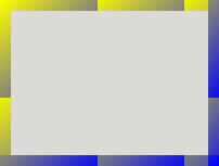
Example: Linear Gradient
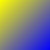
1 2 3 |
-gtk-gradient (linear, left top, right bottom, from(@yellow), to(@blue)); |
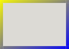
Example: Linear Gradient 2
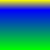
1 2 3 4 5 |
-gtk-gradient (linear, 0 0, 0 1, color-stop(0, @yellow), color-stop(0.2, @blue), color-stop(1, #0f0)) |
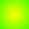
Radial Gradients
A radial gradient along the two circles defined by (start_x,
start_y, start_radius) and (end_x, end_y, end_radius) is
specified using the following syntax:
-gtk-gradient (radial, start_x start_y, start_radius, end_x end_y, end_radius, color-stop (position, color), ...)
where start_radius and end_radius are floating point numbers
and the other parameters are as before.

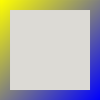
Border images
Images and gradients can also be used in slices for the purpose of creating scalable borders. For more information, see the CSS3 documentation for the border-image property.

The parameters of the slicing process are controlled by four separate properties.
Image Source
Image Slice
Image Width
Image Repeat
Note that you can use the border-image shorthand property to set
values for the properties at the same time.
Image Source
The border image source can be specified either as a URL or a gradient:
1 |
border-image-source: url(path); |
or
1 |
border-image-source: -gtk-gradient(...); |
Image Slice
1 |
border-image-slice: top right bottom left; |
The sizes specified by the top, right, bottom, and left parameters
are the offsets (in pixels) from the relevant edge where the image
should be “cut off” to build the slices used for the rendering
of the border.
Image Width
1 |
border-image-width: top right bottom left; |
The sizes specified by the top
, right
, bottom
and left
parameters
are inward distances from the border box edge, used to specify the
rendered size of each slice determined by border-image-slice.
If this property is not specified, the values of border-width will
be used as a fallback.
Image Repeat
Specifies how the image slices should be rendered in the area outlined by border-width.
1 |
border-image-repeat: [stretch|repeat|round|space]; |
or
1 |
border-image-repeat: [stretch|repeat|round|space] [stretch|repeat|round|space]; |
The default (stretch) is to resize the slice to fill in the whole allocated area.
If the value of this property is “repeat”, the image slice will be tiled to fill the area.
If the value of this property is “round”, the image slice will be tiled to fill the area, and scaled to fit it exactly a whole number of times.
If the value of this property is “space”, the image slice will be tiled to fill the area, and if it doesn’t fit it exactly a whole number of times, the extra space is distributed as padding around the slices.
If two options are specified, the first one affects the horizontal behaviour and the second one the vertical behaviour. If only one option is specified, it affects both.
Supported Properties
Properties are the part that differ the most to common CSS, not all properties are supported (some are planned to be supported eventually, some others are meaningless or don't map intuitively in a widget based environment).
The currently supported properties are:
background-color: [color|transparent];
-
color: See Specifying Colors1
background-color: shade (@color1, 0.5);
border-color: [color|transparent]{1,4};
color: See Specifying ColorsFour values used to specify: top right bottom left
Three values used to specify: top vertical bottom
Two values used to specify: horizontal vertical
-
One value used to specify: color
1
border-color: red green blue;
border-right-color: [color|transparent];
-
color: See Specifying Colors1
border-right-color: @borders;
border-bottom-color: [color|transparent];
-
color: See Specifying Colors1
border-bottom-color: @borders;
font-family: name;
The name of the font family or font name to use.
Note: unlike the CSS2 Specification this does not support using a prioritized list of font family names and/or generic family names.
1 |
font-family: Sans, Cantarell; |
font-style: [normal|oblique|italic];
Selects between normal, italic and oblique faces within a font family.
1 |
font-style: italic; |
font-variant: [normal|small-caps];
In a small-caps font the lower case letters look similar to the uppercase ones, but in a smaller size and with slightly different proportions.
1 |
font-variant: normal; |
font-weight: [normal|bold|bolder|lighter|100|200|300|400|500|600|700|800|900];
Selects the weight of the font. The values '100' to '900' form an ordered sequence, where each number indicates a weight that is at least as dark as its predecessor. The keyword 'normal' is synonymous with '400', and 'bold' is synonymous with '700'. Keywords other than 'normal' and 'bold' have been shown to be often confused with font names and a numerical scale was therefore chosen for the 9-value list.
-
Maps to PANGO_TYPE_WEIGHT
1
font-weight: bold;
font-size: [absolute-size|relative-size|percentage];
absolute-size: The size in normal size units likepx,pt, andem. Or symbolic sizes likexx-small,x-small,small,medium,large,x-large,xx-large.relative-size:largerorsmallerrelative to the parent.-
percentage: A percentage difference from the nominal size.1
font-size: 12px;
font: family variant;
A shorthand for setting a few font properties at once.
Supports any format accepted by
pango_font_description_from_string()-
Note: this is somewhat different from the CSS2 Specification for this property.
1
font: Bold 11;
margin: [length|percentage]{1,4};
A shorthand for setting the margin space required on all sides of an element.
Four values used to specify: top right bottom left
Three values used to specify: top horizontal bottom
Two values used to specify: vertical horizontal
-
One value used to specify: margin
1
margin: 1em 2em 4em;
margin-top: [length|percentage];
Sets the margin space required on the top of an element.
1 |
margin-top: 10px; |
margin-right: [length|percentage];
Sets the margin space required on the right of an element.
1 |
margin-right: 0px; |
margin-bottom: [length|percentage];
Sets the margin space required on the bottom of an element.
1 |
margin-bottom: 10px; |
margin-left: [length|percentage];
Sets the margin space required on the left of an element.
1 |
margin-left: 1em; |
padding: [length|percentage]{1,4};
A shorthand for setting the padding space required on all sides of an element. The padding area is the space between the content of the element and its border.
Four values used to specify: top right bottom left
Three values used to specify: top horizontal bottom
Two values used to specify: vertical horizontal
-
One value used to specify: padding
1
padding: 1em 2em 4em;
padding-top: [length|percentage];
Sets the padding space required on the top of an element.
1 |
padding-top: 10px; |
padding-right: [length|percentage];
Sets the padding space required on the right of an element.
1 |
padding-right: 0px; |
padding-bottom: [length|percentage];
Sets the padding space required on the bottom of an element.
1 |
padding-bottom: 10px; |
padding-left: [length|percentage];
Sets the padding space required on the left of an element.
1 |
padding-left: 1em; |
border-width: [width]{1,4};
A shorthand for setting the border width on all sides of an element.
Four values used to specify: top right bottom left
Three values used to specify: top vertical bottom
Two values used to specify: horizontal vertical
-
One value used to specify: width
1
border-width: 1px 2px 4px;
border-top-width: [width];
Sets the border width required on the top of an element.
1 |
border-top: 10px; |
border-right-width: [width];
Sets the border width required on the right of an element.
1 |
border-right: 0px; |
border-bottom-width: [width];
Sets the border width required on the bottom of an element.
1 |
border-bottom: 10px; |
border-left-width: [width];
Sets the border width required on the left of an element.
1 |
border-left: 1em; |
border-radius: [length|percentage]{1,4};
Allows setting how rounded all border corners are.
Four values used to specify: top-left top-right bottom-right bottom-left
Three values used to specify: top-left top-right-and-bottom-left bottom-right
Two values used to specify: top-left-and-bottom-right top-right-and-bottom-left
-
One value used to specify: radius on all sides
1
border-radius: 8px
border-style: [none|solid|inset|outset]{1,4};
A shorthand property for setting the line style for all four sides of the elements border.
Four values used to specify: top right bottom left;
Three values used to specify: top horizontal bottom
Two values used to specify: vertical horizontal
-
One value used to specify: style
1
border-style: solid;
border-image: source / width ; A shorthand
for setting an image on the borders of elements. See Border Images.
1 |
border-image: url("/path/to/image.png") 3 4 4 3 repeat stretch; |
border-image-source: [none|url|linear-gradient]{1,4};
Defines the image to use instead of the style of the border. If this property is set to none, the style defined by border-style is used instead.
1 |
border-image-source: url("/path/to/image.png"); |
border-image-slice: [number|percentage]{1,4};
Divides the image specified by border-image-source in nine regions: the four corners, the four edges and the middle. It does this by specifying 4 inwards offsets.
Four values used to specify: top right bottom left;
Three values used to specify: top vertical bottom
Two values used to specify: horizontal vertical
-
One value used to specify: slice
1
border-image-slice: 3 3 4 3;
border-image-width: [length|percentage]{1,4};
Defines the offset to use for dividing the border image in nine parts, the top-left corner, central top edge, top-right-corner, central right edge, bottom-right corner, central bottom edge, bottom-left corner, and central right edge. They represent inward distance from the top, right, bottom, and left edges.
Four values used to specify: top right bottom left;
Three values used to specify: top horizontal bottom
Two values used to specify: vertical horizontal
-
One value used to specify: width
1
border-image-width: 4px 0 4px 0;
border-image-repeat: [none|url|linear-gradient]{1,4};
Defines how the middle part of a border image is handled to match the size of the border. It has a one-value syntax which describes the behavior for all sides, and a two-value syntax that sets a different value for the horizontal and vertical behavior.
Two values used to specify: horizontal vertical
-
One value used to specify: repeat
1
border-image-repeat: stretch;
background-image: [none|url|linear-gradient], ...
Sets one or several background images for an element. The images are drawn on successive stacking context layers, with the first specified being drawn as if it is the closest to the user. The borders of the element are then drawn on top of them, and the background-color is drawn beneath them.
-
There can be several sources listed, separated by commas.
1
2
3
background-image: gtk-gradient (linear, left top, right top, from (#fff), to (#000));
background-repeat: [repeat|no-repeat|space|round|repeat-x|repeat-y];
Defines how background images are repeated. A background image can be repeated along the horizontal axis, the vertical axis, both, or not repeated at all.
repeat: The image is repeated in the given direction as much as needed to cover the whole background image painting area. The last image may be clipped if the whole thing won't fit in the remaining area.space: The image is repeated in the given direction as much as needed to cover most of the background image painting area, without clipping an image. The remaining non-covered space is spaced out evenly between the images. The first and last images touches the edge of the element. The value of the background-position CSS property is ignored for the concerned direction, except if one single image is greater than the background image painting area, which is the only case where an image can be clipped when the space value is used.round: The image is repeated in the given direction as much as needed to cover most of the background image painting area, without clipping an image. If it doesn't cover exactly the area, the tiles are resized in that direction in order to match it.no-repeat: The image is not repeated (and hence the background image painting area will not necessarily been entirely covered). The position of the non-repeated background image is defined by the background-position CSS property.-
Note if not specified, the style doesn’t respect the CSS3 specification, since the background will be stretched to fill the area.
1
background-repeat: no-repeat;
text-shadow: horizontal_offset vertical_offset [ blur_radius ] color;
A shadow list can be applied to text or symbolic icons, using the CSS3 text-shadow syntax, as defined in the CSS3 Specification.
The offset of the shadow is specified with the
horizontal_offsetandvertical_offsetparameters.The optional blur radius is parsed, but it is currently not rendered by the GTK+ theming engine.
To set a shadow on an icon, use the icon-shadow property instead,
with the same syntax.
To set multiple shadows on an element, you can specify a comma-separated list
of shadow elements in the text-shadow or icon-shadow property. Shadows are
always rendered front to back (i.e. the first shadow specified is on top of the
others). Shadows can thus overlay each other, but they can never overlay the
text or icon itself, which is always rendered on top of the shadow layer.
1 |
text-shadow: text-shadow: 1 1 0 blue, -4 -4 red; |
box-shadow: [ inset ] horizontal_offset vertical_offset blur_radius color;
Themes can apply shadows on framed elements using the CSS3 box-shadow syntax, as defined in the CSS3 Specification.
A positive offset will draw a shadow that is offset to the right (down) of the box,
A negative offset to the left (top).
The optional spread parameter defines an additional distance to expand the shadow shape in all directions, by the specified radius.
The optional blur radius parameter is parsed, but it is currently not rendered by the GTK+ theming engine.
The inset parameter defines whether the drop shadow should be rendered inside or outside the box canvas.
To set multiple box-shadows on an element, you can specify a comma-separated list
of shadow elements in the box-shadow property. Shadows are always rendered
front to back (i.e. the first shadow specified is on top of the others) so they may
overlap other boxes or other shadows.
1 |
box-shadow: inset 0 1px 1px alpha(black, 0.1); |
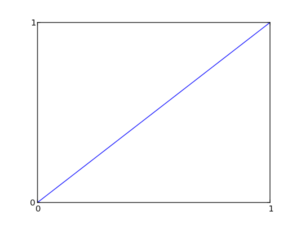
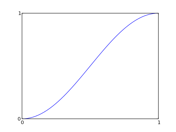
transition: duration s|ms [loop];
Styles can specify transitions that will be used to create a gradual change in the appearance when a widget state changes.
The
durationis the amount of time that the animation will take for a complete cycle from start to end.If the loop option is given, the animation will be repated until the state changes again.
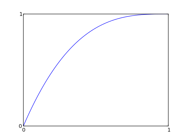
The option after the duration determines the transition function from a small set of predefined functions.
-
Linear
Ease transition
Ease-in-out transition
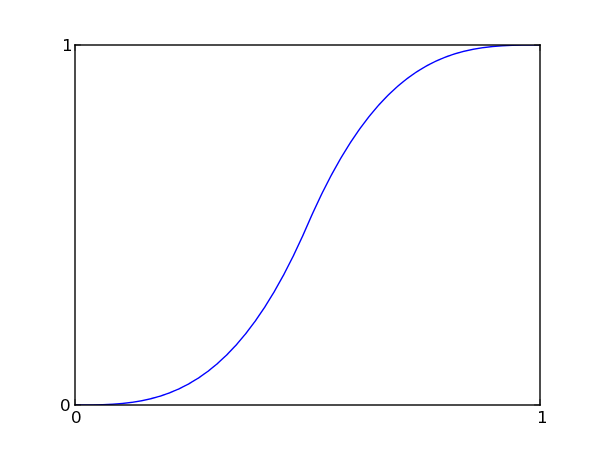
Ease-in transition
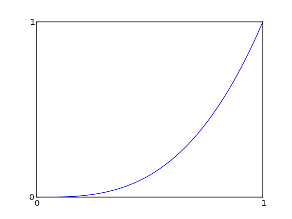
Ease-out transition
1 |
transition: 150ms ease-in-out; |
Other Properties
GtkThemingEngines can register their own, engine-specific style properties
with the function gtk_theming_engine_register_property(). These properties
can be set in CSS like other properties, using a name of the form
-namespace-name, where namespace is typically
the name of the theming engine, and name is the
name of the property. Style properties that have been registered by widgets
using gtk_widget_class_install_style_property() can also be set in this
way, using the widget class name for namespace.
An example for using engine-specific style properties:
1 2 3 4 5 6 |
* { engine: clearlooks; border-radius: 4; -GtkPaned-handle-size: 6; -clearlooks-colorize-scrollbar: false; } |
Functions
gtk_css_provider_get_default ()
GtkCssProvider *
gtk_css_provider_get_default (void);
Returns the provider containing the style settings used as a fallback for all widgets.
gtk_css_provider_get_named ()
GtkCssProvider * gtk_css_provider_get_named (const gchar *name,const gchar *variant);
Loads a theme from the usual theme paths
Parameters
name |
A theme name |
|
variant |
variant to load, for example, "dark", or
|
[allow-none] |
Returns
a GtkCssProvider with the theme loaded. This memory is owned by GTK+, and you must not free it.
[transfer none]
gtk_css_provider_load_from_data ()
gboolean gtk_css_provider_load_from_data (GtkCssProvider *css_provider,const gchar *data,gssize length,GError **error);
Loads data
into css_provider
, making it clear any previously loaded
information.
gtk_css_provider_load_from_file ()
gboolean gtk_css_provider_load_from_file (GtkCssProvider *css_provider,GFile *file,GError **error);
Loads the data contained in file
into css_provider
, making it
clear any previously loaded information.
gtk_css_provider_load_from_path ()
gboolean gtk_css_provider_load_from_path (GtkCssProvider *css_provider,const gchar *path,GError **error);
Loads the data contained in path
into css_provider
, making it clear
any previously loaded information.
gtk_css_provider_new ()
GtkCssProvider *
gtk_css_provider_new (void);
Returns a newly created GtkCssProvider.
gtk_css_provider_to_string ()
char *
gtk_css_provider_to_string (GtkCssProvider *provider);
Converts the provider
into a string representation in CSS
format.
Using gtk_css_provider_load_from_data() with the return value
from this function on a new provider created with
gtk_css_provider_new() will basically create a duplicate of
this provider
.
Since 3.2
gtk_css_section_get_end_line ()
guint
gtk_css_section_get_end_line (const GtkCssSection *section);
Returns the line in the CSS document where this section end.
The line number is 0-indexed, so the first line of the document
will return 0.
This value may change in future invocations of this function if
section
is not yet parsed completely. This will for example
happen in the GtkCssProvider::parsing-error signal.
The end position and line may be identical to the start
position and line for sections which failed to parse anything
successfully.
Since 3.2
gtk_css_section_get_end_position ()
guint
gtk_css_section_get_end_position (const GtkCssSection *section);
Returns the offset in bytes from the start of the current line
returned via gtk_css_section_get_end_line().
This value may change in future invocations of this function if
section
is not yet parsed completely. This will for example
happen in the GtkCssProvider::parsing-error signal.
The end position and line may be identical to the start
position and line for sections which failed to parse anything
successfully.
Since 3.2
gtk_css_section_get_file ()
GFile *
gtk_css_section_get_file (const GtkCssSection *section);
Gets the file that section
was parsed from. If no such file exists,
for example because the CSS was loaded via
gtk_css_provider_load_from_data()NULL is returned.
Returns
the GFile that section
was parsed from
or NULL if section
was parsed from other data.
[transfer none]
Since 3.2
gtk_css_section_get_parent ()
GtkCssSection *
gtk_css_section_get_parent (const GtkCssSection *section);
Gets the parent section for the given section
. The parent section is
the section that contains this section
. A special case are sections of
type GTK_CSS_SECTION_DOCUMENT. Their parent will either be NULL
if they are the original CSS document that was loaded by
gtk_css_provider_load_from_file() or a section of type
GTK_CSS_SECTION_IMPORT if it was loaded with an import rule from
a different file.
Since 3.2
gtk_css_section_get_section_type ()
GtkCssSectionType
gtk_css_section_get_section_type (const GtkCssSection *section);
Gets the type of information that section
describes.
Since 3.2
gtk_css_section_get_start_line ()
guint
gtk_css_section_get_start_line (const GtkCssSection *section);
Returns the line in the CSS document where this section starts. The line number is 0-indexed, so the first line of the document will return 0.
Since 3.2
gtk_css_section_get_start_position ()
guint
gtk_css_section_get_start_position (const GtkCssSection *section);
Returns the offset in bytes from the start of the current line
returned via gtk_css_section_get_start_line().
Since 3.2
gtk_css_section_ref ()
GtkCssSection *
gtk_css_section_ref (GtkCssSection *section);
Increments the reference count on section
.
Since 3.2
gtk_css_section_unref ()
void
gtk_css_section_unref (GtkCssSection *section);
Decrements the reference count on section
, freeing the
structure if the reference count reaches 0.
Since 3.2
Types and Values
enum GtkCssProviderError
GtkCssProviderError is deprecated and should not be used in newly-written code.
Deprecated.
GtkCssSection
typedef struct _GtkCssSection GtkCssSection;
Defines a part of a CSS document. Because sections are nested into
one another, you can use gtk_css_section_get_parent() to get the
containing region.
Since 3.2
enum GtkCssSectionType
The different types of sections indicate parts of a CSS document as parsed by GTK’s CSS parser. They are oriented towards the CSS Grammar, but may contain extensions.
More types might be added in the future as the parser incorporates more features.
Members
|
The section describes a complete document.
This section time is the only one where |
||
|
The section defines an import rule. |
||
|
The section defines a color. This is a GTK extension to CSS. |
||
|
The section defines a binding set. This is a GTK extension to CSS. |
||
|
The section defines a CSS ruleset. |
||
|
The section defines a CSS selector. |
||
|
The section defines the declaration of a CSS variable. |
||
|
The section defines the value of a CSS declaration. |
||
|
The section defines keyframes. See CSS Animations for details. Since 3.6 |
Since 3.2
Signal Details
The “parsing-error” signal
void
user_function (GtkCssProvider *provider,
               GtkCssSection  *section,
               GError         *error,
               gpointer        user_data)
Signals that a parsing error occured. the path
, line
and position
describe the actual location of the error as accurately as possible.
Parsing errors are never fatal, so the parsing will resume after the error. Errors may however cause parts of the given data or even all of it to not be parsed at all. So it is a useful idea to check that the parsing succeeds by connecting to this signal.
Note that this signal may be emitted at any time as the css provider may opt to defer parsing parts or all of the input to a later time than when a loading function was called.
Parameters
provider |
the provider that had a parsing error |
|
section |
section the error happened in |
|
error |
The parsing error |
|
user_data |
user data set when the signal handler was connected. |
Flags: Run Last